Design Challenge: A smoother, smarter transfer experience.
The bank's name has been omitted — but this case study is based on a real UK banking app.
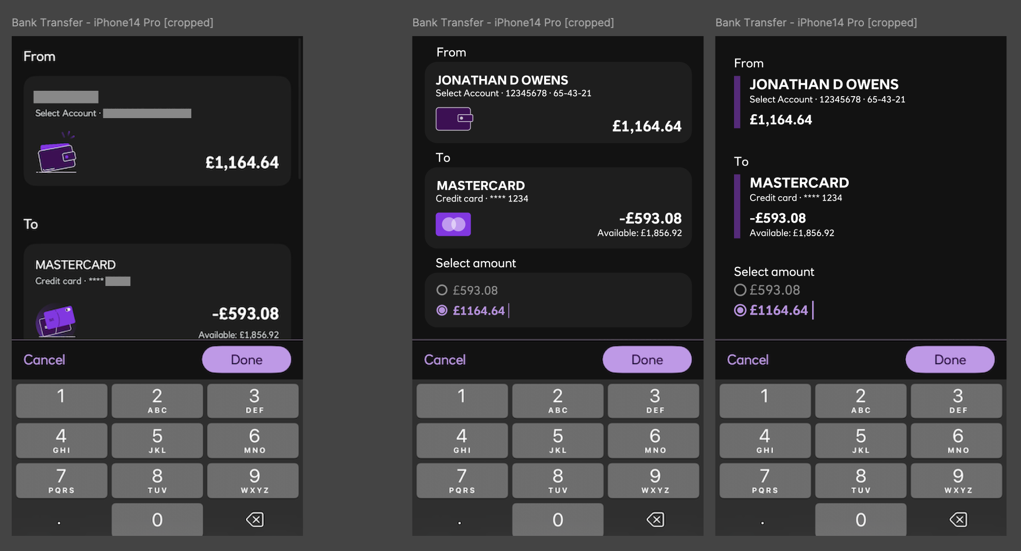
The existing user experience of transferring funds between accounts in the app presents several friction points — even on larger devices like the iPhone 14 Pro.
Despite the app knowing both the outstanding debt (-£593.08) and the available balance (£1,164.64), the only suggested transfer options are £0.00 and “Other amount.” This lacks context, logic, and empathy — the app fails to assist when it knows exactly what the user likely wants to do.
Usability constraints quickly follow:
- When the numeric keyboard is active, critical UI elements are pushed off-screen, including the "From" and "To" accounts — even on a 1179x2556px (373x809 pts) device.
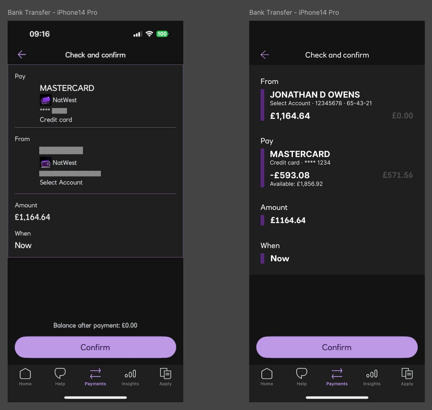
- The confirmation screen breaks the visual and cognitive flow — flipping "From" and "To" fields, introducing misalignment, and generally feeling like an afterthought.
Key observations:
- Confusing flow at a critical interaction point.
- Inefficient use of screen space (especially with the keyboard open).
- Inconsistent components and visual styling.
- Missed opportunities for smart defaults and intelligent suggestions.
Rather than overcomplicating the fix, this case study explores a refined, responsive layout tailored specifically to fit within the active screen space on a modern iPhone — with the keyboard open.
Solutions explored:
- A compact, single-screen layout with a simplified hierarchy and reduced visual noise.
- UI components restructured using an 8-point grid for consistency, balance, and clarity.
- Streamlined font usage and spacing for improved readability and cleaner visual rhythm.
- Redesigned confirmation screen that maintains logical flow and includes post-transfer balances — offering clarity and reassurance.
- Audit of existing components uncovered inconsistencies in layout, alignment, and visual logic — all addressed in the redesign.
Outcome:
A cleaner, smarter, and more intuitive transfer experience — designed to anticipate user intent, stay visually coherent, and respect every pixel of screen real estate.