Design Exercise – UX / UI / Visual System
The airport's name has been omitted — but this case study is based on a real UK airport.
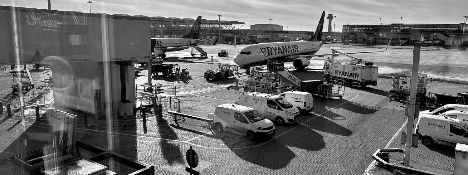
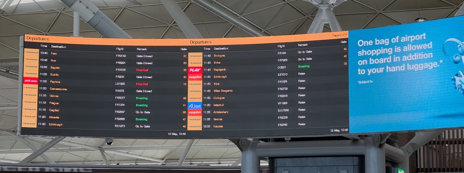
At Airport, two large screens sit side by side in the main departures hall, displaying a combined list of 22 upcoming flights. They're meant to guide, but instead, they overwhelm.
- Type is too small to read at a glance.
- Line spacing stretches awkwardly, creating more white space than content.
- Columns are spaced too wide
- The boundary between the two screens is practically invisible.
For travelers on the move, it's a moment of friction where there should be flow.
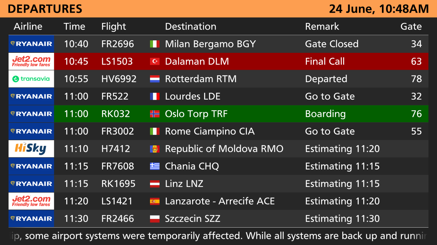
My Approach - a redesigned system that brings clarity, order, and visual calm to a chaotic space:
- Designed natively for 8K resolution – ensuring crisp, high-impact visuals at scale
- Larger, more legible typography – easily readable from across the hall
- Country flags added – offering instant destination context at a glance
- Strategic margins between screens – creating visual separation to avoid confusion
The result is a departure board that's not just better-looking — it's easier to use, faster to scan, and built with the traveler in mind.